The Bell Curve Generator creates normal distribution curves (bell curves) using either manually specified parameters or from your actual data. You can generate multiple curves on the same chart to compare different distributions, visualize how changing parameters affects the shape, or overlay theoretical curves with your data histograms.
If you need to calculate probabilities or z-scores for specific values, check out our Normal Distribution Calculator. For testing whether your data follows a normal distribution, use the Normality Test Calculator.
When comparing multiple bell curves, you can observe how different parameters affect the distribution shape:
A bell curve, also known as a normal distribution curve or Gaussian curve, is a symmetrical probability distribution that resembles a bell shape. It's one of the most important distributions in statistics, as many natural phenomena follow this pattern.
The curve is completely defined by two parameters: the mean (μ), which determines the center of the curve, and the standard deviation (σ), which determines the spread or width of the curve.
R provides multiple ways to create bell curves. Here are some examples:
# Create a bell curve with specific parameters
mean_val <- 100
sd_val <- 15

x <- seq(mean_val - 4*sd_val, mean_val + 4*sd_val, length.out = 1000)
y <- dnorm(x, mean = mean_val, sd = sd_val)

# plot the bell curve
plot(x, y, type = "l", lwd = 2, col = "blue",
     main = "Bell Curve (Normal Distribution)",
     xlab = "Value", ylab = "Density")

# add vertical line at mean
abline(v = mean_val, col = "red", lty = 2)

# add shaded areas for standard deviations
x1 <- seq(mean_val - sd_val, mean_val + sd_val, length.out = 100)
y1 <- dnorm(x1, mean = mean_val, sd = sd_val)
polygon(c(x1, rev(x1)), c(y1, rep(0, length(y1))),
        col = rgb(0, 0, 1, 0.3), border = NA)
library(tidyverse)

df <- tibble(x = seq(-4, 4, length.out = 1000)) |>
    mutate(y = dnorm(x))

ggplot(df, aes(x = x, y = y)) +
  geom_line(linewidth = 1.5, color = "darkblue") +
  geom_area(data = subset(df, x >= -1 & x <= 1),
            aes(x = x, y = y), fill = "blue", alpha = 0.3) +
  geom_vline(xintercept = 0, linetype = "dashed", color = "red") +
  scale_x_continuous(breaks = -3:3,
                     labels = paste0("μ", c("-3σ", "-2σ", "-σ", "", "+σ", "+2σ", "+3σ"))) +
  labs(title = "Standard Normal Distribution",
       x = "Standard Deviations from Mean",
       y = "Probability Density") +
  theme_minimal()
library(tidyverse)

x_seq <- seq(-10, 20, length.out = 1000)

df <- tibble(
  x = rep(x_seq, 3),
  y = c(
    dnorm(x_seq, mean = 0, sd = 1),
    dnorm(x_seq, mean = 5, sd = 2),
    dnorm(x_seq, mean = 10, sd = 3)
  ),
  Distribution = rep(c("μ=0, σ=1", "μ=5, σ=2", "μ=10, σ=3"), each = length(x_seq))
)

# Plot multiple bell curves
ggplot(df, aes(x = x, y = y, color = Distribution)) +
  geom_line(linewidth = 1.2) +
  labs(title = "Comparing Normal Distributions",
       x = "Value", y = "Density") +
  theme_minimal() +
  scale_color_brewer(palette = "Set1")
# Generate Bell Curve (Normal Distribution) in Excel

## Step 1: Set up X values
# In column A, create a range of x-values
A1: X Values
A2: -4
A3: =A2+0.1
# Copy A3 down to A82 (creates range from -4 to 4 in 0.1 increments)
# notice that 0 could be displayed as an extreme small number like 1E-10

## Step 2: Calculate Normal Distribution (Single Curve)
# In column B, calculate probability density using NORM.DIST
B1: Bell Curve (μ=0, σ=1)
B2: =NORM.DIST(A2,0,1,FALSE)
# Copy B2 down to B82


## Step 4: Create the Chart
# 1. Select data range B1:B82
# 2. Insert > Charts > Line Chart > Line
# 3. Right-click x-axis > Select Data > Horizontal (Category) Axis Labels > Edit
#    Select A2:A82
# 3. Format chart:
#    - Chart Title: "Bell Curve (Normal Distribution)"
#    - X-axis: "Value"
#    - Y-axis: "Probability Density"


## Alternative: Using Excel's Built-in Normal Distribution Template
# Go to Insert > Charts > Statistical Charts > Histogram
# Or use Analysis ToolPak: Data > Data Analysis > Random Number Generation

## Key Excel Functions:
# NORM.DIST(x, mean, std_dev, cumulative)
# - x: the value to evaluate
# - mean: arithmetic mean (μ)
# - std_dev: standard deviation (σ)
# - cumulative: FALSE for probability density function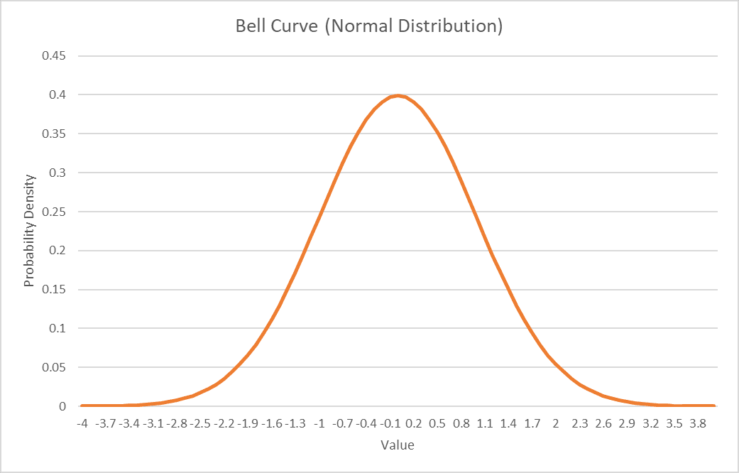
The mean determines the center of the bell curve. It represents the average value of the distribution.
The standard deviation controls the width and height of the bell curve. It measures the spread of the data.