A scatter plot is a powerful visualization tool that displays the relationship between two numerical variables. Each point on the plot represents an observation in your dataset, with its position determined by the values of the selected X and Y columns. Scatter plots are ideal for spotting trends, patterns, clusters, and outliers, and are commonly used to assess correlation and linearity between variables.
To get started, upload your data or use our sample datasets, then select the columns you want to visualize. You can color points by categories, add trend lines, or create small multiples (facets) for deeper insights. For visualizations that require a third numerical dimension displayed as size, use our Bubble Chart Maker. Not sure how to begin? See our step-by-step tutorial below.
A scatter plot (also called a scattergram) is a graph that shows the relationship between two continuous variables. Each point represents an individual data point, with its position determined by its x and y values. Scatter plots are ideal for visualizing correlation between variables and identifying patterns in your data.

The diagram above illustrates the components of a scatter plot. Each point represents a data pair, while the trend line shows the general relationship direction. The spread of points indicates the strength of correlation.
Understanding scatter plots becomes intuitive once you know what to look for:
Tip: If you need to visualize a third numerical dimension as point size (like party size affecting tips), use our Bubble Chart Maker instead.
One of the main purposes of scatter plots is to visualize correlation between variables. Here's how to interpret different correlation patterns:
As X increases, Y tends to increase
As X increases, Y tends to decrease
No clear relationship between X and Y
The correlation coefficient quantifies the strength and direction of a linear relationship:
Use different colors to represent different groups or categories within your data, making it easier to spot group-specific patterns.
Create a series of scatter plots side-by-side, each showing data for a different category. This helps compare patterns across groups.
Add regression lines or curves (linear, logarithmic, exponential) to visualize the general relationship between variables and make predictions.
Create a grid of scatter plots showing relationships between multiple variables simultaneously for comprehensive multivariate analysis.
Correlation (r) = Σ[(xi - x̄)(yi - ȳ)] / √[Σ(xi - x̄)² × Σ(yi - ȳ)²]
Linear Regression: y = mx + b
where m = Σ[(xi - x̄)(yi - ȳ)] / Σ(xi - x̄)²
Coefficient of Determination (R²) = r²
Standard Error = √[Σ(yi - ŷi)² / (n-2)]
Use a scatter plot when you want to examine the relationship between two continuous variables. Use a bubble chart when you have a third numerical variable that you want to represent as the size of the points. Scatter plots are simpler and clearer for basic correlation analysis, while bubble charts add an extra dimension of information.
Correlation shows that two variables change together, but doesn't prove that one causes the other. Causation means one variable directly affects the other. A scatter plot can reveal correlation, but establishing causation requires controlled experiments and additional analysis.
Outliers are points that deviate significantly from the overall pattern. They may represent data errors, special cases, or important insights. Investigate outliers to determine if they should be removed (if they're errors) or highlighted (if they reveal something important about your data).
Yes. While a simple linear trend line won't capture non-linear patterns, the scatter of points themselves will reveal curved or complex relationships. You can add non-linear trend lines (polynomial, logarithmic, exponential) to better fit such data patterns.
Microsoft Excel is one of the most popular tools for creating scatter plots. Here's how to make a scatter plot in Excel:
Excel Tips:
CORREL(array1,array2) to calculate correlation coefficientLINEST(y_values,x_values) for detailed regression statisticsUse libraries like matplotlib and seaborn to create scatter plots in Python. Here's an example using the popular tips dataset:
import pandas as pd
import matplotlib.pyplot as plt
import seaborn as sns
import numpy as np

# Load the data
tips = pd.read_csv("https://raw.githubusercontent.com/plotly/datasets/master/tips.csv")

# Set style for better-looking plots
plt.style.use('seaborn-v0_8')
sns.set_palette("husl")


# Calculate correlation
correlation = np.corrcoef(tips['total_bill'], tips['tip'])[0, 1]
print(f"Correlation coefficient: {correlation:.4f}")

# Scatter plot with regression line using seaborn
plt.figure(figsize=(10, 6))
sns.regplot(x='total_bill', y='tip', data=tips, scatter_kws={'alpha':0.5}, line_kws={'color':'red'})
plt.title(f'Scatter Plot with Regression Line (r = {correlation:.4f})')
plt.xlabel('Total Bill ($)')
plt.ylabel('Tip Amount ($)')
plt.show()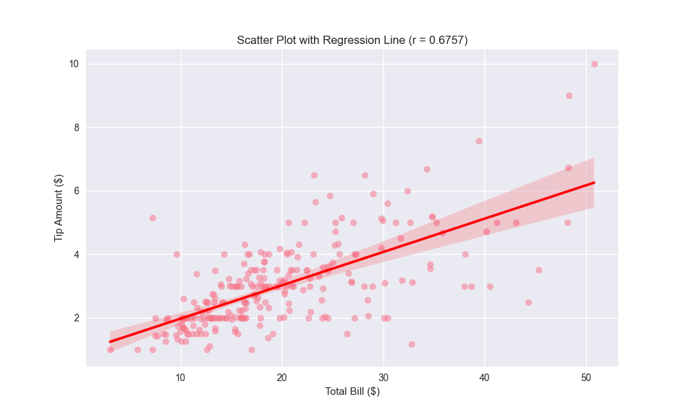
# Create a scatter plot with time and day
plt.figure(figsize=(12, 8))
sns.scatterplot(data=tips, x='total_bill', y='tip',
                hue='time', style='day',
                palette='viridis', alpha=0.7)
plt.title('Restaurant Tips by Total Bill, Time, and Day')
plt.xlabel('Total Bill ($)')
plt.ylabel('Tip Amount ($)')
plt.legend(title='Legend')
plt.show()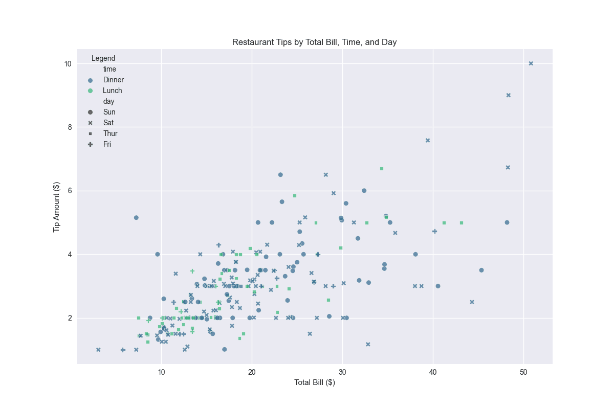
Use ggplot2 to create scatter plots in R. Here's how to do it:
library(tidyverse)

# Load tips dataset
tips <- read.csv("https://raw.githubusercontent.com/plotly/datasets/master/tips.csv")

# basic scatter plot with a regression line
ggplot(tips, aes(x = total_bill, y = tip)) +
  geom_point(size = 3, alpha = 0.7) +
  geom_smooth(method = "lm", color = "blue", fill = "lightblue") +
  labs(title = "Tips vs Total Bill with Linear Regression",
       x = "Total Bill ($)",
       y = "Tip Amount ($)") +
  theme_minimal()
# scatter plot colored by day with facets for time of day
ggplot(tips, aes(x = total_bill, y = tip, color = day)) +
  geom_point(size = 2, alpha = 0.7) +
  geom_smooth(method = "lm", se = FALSE, linewidth = 0.5) +
  facet_wrap(~time, labeller = labeller(time = c("Lunch" = "Lunch", "Dinner" = "Dinner"))) +
  scale_color_brewer(palette = "Set1", name = "Day") +
  labs(title = "Restaurant Tips Analysis by Time of Day",
       subtitle = "Colored by day of week",
       x = "Total Bill ($)",
       y = "Tip Amount ($)") +
  theme_minimal() +
  theme(legend.position = "bottom")