This bar chart maker helps you create exactly what you need - whether that's a simple bar chart, grouped bars to compare multiple data series, or stacked bar charts to show how different parts contribute to the whole. You can easily customize everything: flip between vertical and horizontal layouts, sort your data alphabetically, by values, or in any custom order you want. Add colors to group your data, display everything as percentages, or use 100% stacked charts when you want to focus on proportions. Not sure how to begin? Check out our step-by-step tutorial.
Leave as "Auto-calculate" to count frequencies of categories, or select a numeric column for values
Select a "Color By" column to enable different bar modes
With "None" selected, you can customize the chart below
A bar chart (or bar graph) is a visual representation of categorical data using rectangular bars, where the lengths of the bars are proportional to the values they represent. They're ideal for comparing discrete categories or groups, showing counts, frequencies, sums, or other metrics.
The standard bar chart with vertical bars. Categories are on the x-axis and values on the y-axis. Best for category labels that are short.
Categories on the y-axis with horizontal bars extending right. Excellent for longer category names or when you have many categories.
Shows multiple related data series side by side, enabling both comparison within categories and between categories.
Segments within each bar show component parts of the total. Shows both overall values and composition of each category.
A variation of stacked bars where each bar is the same height (100%), showing percentage contribution of each component.
Multiple bars for each category are organized in clusters, allowing comparisons across both categories and clusters.
For example, select day to compare metrics across different days of the week
For example, select smoker to compare smoker vs non-smoker patterns by day
Bar charts display categorical data with spaces between bars, while histograms display continuous numerical data with no gaps between bars. Histograms show the distribution of data across ranges (bins), while bar charts compare discrete categories.
Use horizontal bar charts when you have long category names or many categories, as they provide more space for labels. Vertical bar charts work well for fewer categories with short names and are generally more familiar to readers.
For optimal readability, limit your bar chart to 10-12 categories. If you have more categories, consider grouping similar ones, using a horizontal orientation, or using a different visualization method altogether.
Use grouped bar charts when the primary focus is comparing values within each category. Use stacked bar charts when you want to show both individual components and their total, or when displaying part-to-whole relationships is important.
Add clear titles and labels, use high-contrast colors that work for color-blind viewers, include data values on or near each bar, and consider patterns or textures in addition to colors for differentiating bars.
library(tidyverse)

# Load the Restaurant Tips dataset
tips <- read.csv("https://raw.githubusercontent.com/plotly/datasets/master/tips.csv")

# Set the order of days
day_order <- c("Thur", "Fri", "Sat", "Sun")

# Count of customers by day
ggplot(tips, aes(x = factor(day, levels = day_order))) +
  geom_bar(fill = "steelblue") +
  labs(title = "Number of Customers by Day",
       x = "Day",
       y = "Count") +
  theme_minimal()

# Average bill by day
avg_bill_by_day <- tips %>%
  group_by(day) %>%
  summarize(avg_bill = mean(total_bill)) %>%
  mutate(day = factor(day, levels = day_order))

ggplot(avg_bill_by_day, aes(x = day, y = avg_bill)) +
  geom_bar(stat = "identity", fill = "steelblue") +
  labs(title = "Average Bill Amount by Day",
       x = "Day",
       y = "Average Total Bill ($)") +
  theme_minimal()

# ECount by day and smoker
ggplot(tips, aes(x = factor(day, levels = day_order), fill = smoker)) +
  geom_bar(position = "stack") +
  labs(title = "Customer Count by Day and Smoker Status",
       x = "Day",
       y = "Count",
       fill = "Smoker") +
  theme_minimal()
The ggpubr package provides the ggbarplot() function, which offers a simpler way to create publication-ready bar charts with built-in statistical features:
library(tidyverse)
library(ggpubr)

# Load the Restaurant Tips dataset
tips <- read.csv("https://raw.githubusercontent.com/plotly/datasets/master/tips.csv")

# Set the order of days
day_order <- c("Thur", "Fri", "Sat", "Sun")

# Calculate average bill by day and smoker status
avg_bill_by_day_smoker <- tips %>%
  group_by(day, smoker) %>%
  summarize(avg_bill = mean(total_bill), .groups = "drop") %>%
  mutate(day = factor(day, levels = day_order))

# Create grouped bar plot using ggbarplot
ggbarplot(
  avg_bill_by_day_smoker,
  x = "day",
  y = "avg_bill",
  fill = "smoker",       # Color by smoker status
  color = "smoker",      # Border color
  palette = "jco",       # Color palette
  position = position_dodge(0.8),  # Grouped bars
  xlab = "Day",
  ylab = "Average Total Bill ($)",
  title = "Average Bill Amount by Day and Smoker Status",
  legend.title = "Smoker",
  ggtheme = theme_pubr()
) +
  font("title", size = 14, face = "bold") +
  font("caption", size = 10, face = "italic") +
  font("xlab", size = 12) +
  font("ylab", size = 12)
import pandas as pd
import matplotlib.pyplot as plt
import seaborn as sns

# Load the Restaurant Tips dataset
tips = pd.read_csv("https://raw.githubusercontent.com/plotly/datasets/master/tips.csv")

# Set the order of days
day_order = ['Thur', 'Fri', 'Sat', 'Sun']

# Count of customers by day
plt.figure(figsize=(10, 6))
sns.countplot(data=tips, x='day', order=day_order)
plt.title('Number of Customers by Day')
plt.xlabel('Day')
plt.ylabel('Count')
plt.show()

# Average bill by day
avg_bill_by_day = tips.groupby('day')['total_bill'].mean().reset_index()
avg_bill_by_day['day'] = pd.Categorical(avg_bill_by_day['day'], categories=day_order)
avg_bill_by_day = avg_bill_by_day.sort_values('day')

plt.figure(figsize=(10, 6))
sns.barplot(data=avg_bill_by_day, x='day', y='total_bill')
plt.title('Average Bill Amount by Day')
plt.xlabel('Day')
plt.ylabel('Average Total Bill ($)')
plt.show()

# Average bill by day and smoker status
avg_bill_by_day_smoker = tips.groupby(['day', 'smoker'])['total_bill'].mean().reset_index()
avg_bill_by_day_smoker['day'] = pd.Categorical(avg_bill_by_day_smoker['day'], categories=day_order)
avg_bill_by_day_smoker = avg_bill_by_day_smoker.sort_values('day')

plt.figure(figsize=(12, 6))
sns.barplot(data=avg_bill_by_day_smoker, x='day', y='total_bill', hue='smoker')
plt.title('Average Bill Amount by Day and Smoker Status')
plt.xlabel('Day')
plt.ylabel('Average Total Bill ($)')
plt.legend(title='Smoker')
plt.show()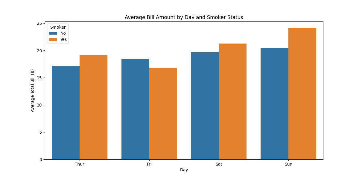
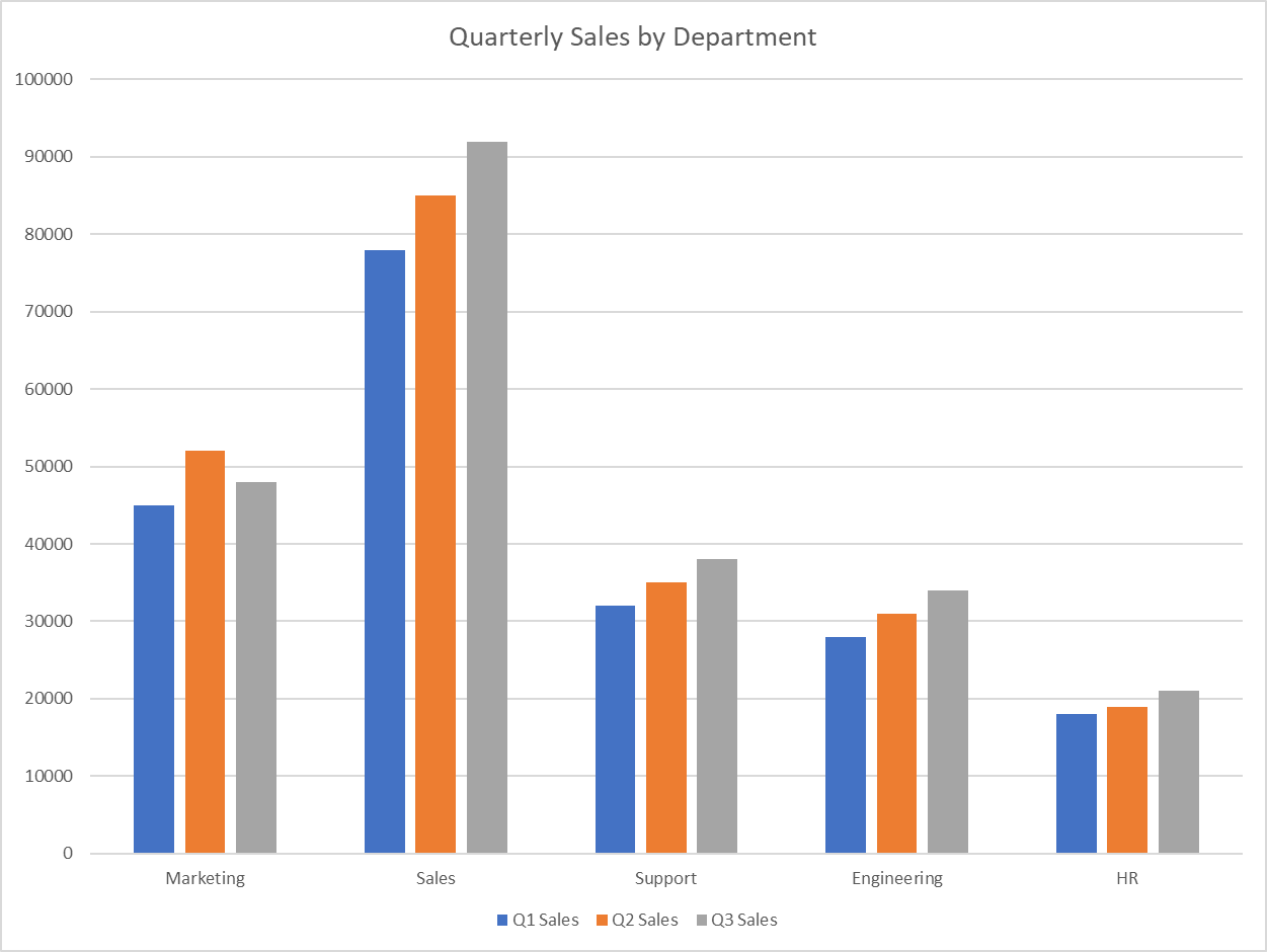
Department	Q1 Sales	Q2 Sales	Q3 Sales
Marketing	45000	52000	48000
Sales	78000	85000	92000
Support	32000	35000	38000
Engineering	28000	31000	34000
HR	18000	19000	21000
This bar chart maker helps you create exactly what you need - whether that's a simple bar chart, grouped bars to compare multiple data series, or stacked bar charts to show how different parts contribute to the whole. You can easily customize everything: flip between vertical and horizontal layouts, sort your data alphabetically, by values, or in any custom order you want. Add colors to group your data, display everything as percentages, or use 100% stacked charts when you want to focus on proportions. Not sure how to begin? Check out our step-by-step tutorial.
Leave as "Auto-calculate" to count frequencies of categories, or select a numeric column for values
Select a "Color By" column to enable different bar modes
With "None" selected, you can customize the chart below
A bar chart (or bar graph) is a visual representation of categorical data using rectangular bars, where the lengths of the bars are proportional to the values they represent. They're ideal for comparing discrete categories or groups, showing counts, frequencies, sums, or other metrics.
The standard bar chart with vertical bars. Categories are on the x-axis and values on the y-axis. Best for category labels that are short.
Categories on the y-axis with horizontal bars extending right. Excellent for longer category names or when you have many categories.
Shows multiple related data series side by side, enabling both comparison within categories and between categories.
Segments within each bar show component parts of the total. Shows both overall values and composition of each category.
A variation of stacked bars where each bar is the same height (100%), showing percentage contribution of each component.
Multiple bars for each category are organized in clusters, allowing comparisons across both categories and clusters.
For example, select day to compare metrics across different days of the week
For example, select smoker to compare smoker vs non-smoker patterns by day
Bar charts display categorical data with spaces between bars, while histograms display continuous numerical data with no gaps between bars. Histograms show the distribution of data across ranges (bins), while bar charts compare discrete categories.
Use horizontal bar charts when you have long category names or many categories, as they provide more space for labels. Vertical bar charts work well for fewer categories with short names and are generally more familiar to readers.
For optimal readability, limit your bar chart to 10-12 categories. If you have more categories, consider grouping similar ones, using a horizontal orientation, or using a different visualization method altogether.
Use grouped bar charts when the primary focus is comparing values within each category. Use stacked bar charts when you want to show both individual components and their total, or when displaying part-to-whole relationships is important.
Add clear titles and labels, use high-contrast colors that work for color-blind viewers, include data values on or near each bar, and consider patterns or textures in addition to colors for differentiating bars.
library(tidyverse)

# Load the Restaurant Tips dataset
tips <- read.csv("https://raw.githubusercontent.com/plotly/datasets/master/tips.csv")

# Set the order of days
day_order <- c("Thur", "Fri", "Sat", "Sun")

# Count of customers by day
ggplot(tips, aes(x = factor(day, levels = day_order))) +
  geom_bar(fill = "steelblue") +
  labs(title = "Number of Customers by Day",
       x = "Day",
       y = "Count") +
  theme_minimal()

# Average bill by day
avg_bill_by_day <- tips %>%
  group_by(day) %>%
  summarize(avg_bill = mean(total_bill)) %>%
  mutate(day = factor(day, levels = day_order))

ggplot(avg_bill_by_day, aes(x = day, y = avg_bill)) +
  geom_bar(stat = "identity", fill = "steelblue") +
  labs(title = "Average Bill Amount by Day",
       x = "Day",
       y = "Average Total Bill ($)") +
  theme_minimal()

# ECount by day and smoker
ggplot(tips, aes(x = factor(day, levels = day_order), fill = smoker)) +
  geom_bar(position = "stack") +
  labs(title = "Customer Count by Day and Smoker Status",
       x = "Day",
       y = "Count",
       fill = "Smoker") +
  theme_minimal()
The ggpubr package provides the ggbarplot() function, which offers a simpler way to create publication-ready bar charts with built-in statistical features:
library(tidyverse)
library(ggpubr)

# Load the Restaurant Tips dataset
tips <- read.csv("https://raw.githubusercontent.com/plotly/datasets/master/tips.csv")

# Set the order of days
day_order <- c("Thur", "Fri", "Sat", "Sun")

# Calculate average bill by day and smoker status
avg_bill_by_day_smoker <- tips %>%
  group_by(day, smoker) %>%
  summarize(avg_bill = mean(total_bill), .groups = "drop") %>%
  mutate(day = factor(day, levels = day_order))

# Create grouped bar plot using ggbarplot
ggbarplot(
  avg_bill_by_day_smoker,
  x = "day",
  y = "avg_bill",
  fill = "smoker",       # Color by smoker status
  color = "smoker",      # Border color
  palette = "jco",       # Color palette
  position = position_dodge(0.8),  # Grouped bars
  xlab = "Day",
  ylab = "Average Total Bill ($)",
  title = "Average Bill Amount by Day and Smoker Status",
  legend.title = "Smoker",
  ggtheme = theme_pubr()
) +
  font("title", size = 14, face = "bold") +
  font("caption", size = 10, face = "italic") +
  font("xlab", size = 12) +
font("ylab", size = 12)import pandas as pd
import matplotlib.pyplot as plt
import seaborn as sns
# Load the Restaurant Tips dataset
tips = pd.read_csv("https://raw.githubusercontent.com/plotly/datasets/master/tips.csv")
# Set the order of days
day_order = ['Thur', 'Fri', 'Sat', 'Sun']
# Count of customers by day
plt.figure(figsize=(10, 6))
sns.countplot(data=tips, x='day', order=day_order)
plt.title('Number of Customers by Day')
plt.xlabel('Day')
plt.ylabel('Count')
plt.show()
# Average bill by day
avg_bill_by_day = tips.groupby('day')['total_bill'].mean().reset_index()
avg_bill_by_day['day'] = pd.Categorical(avg_bill_by_day['day'], categories=day_order)
avg_bill_by_day = avg_bill_by_day.sort_values('day')
plt.figure(figsize=(10, 6))
sns.barplot(data=avg_bill_by_day, x='day', y='total_bill')
plt.title('Average Bill Amount by Day')
plt.xlabel('Day')
plt.ylabel('Average Total Bill ($)')
plt.show()
# Average bill by day and smoker status
avg_bill_by_day_smoker = tips.groupby(['day', 'smoker'])['total_bill'].mean().reset_index()
avg_bill_by_day_smoker['day'] = pd.Categorical(avg_bill_by_day_smoker['day'], categories=day_order)
avg_bill_by_day_smoker = avg_bill_by_day_smoker.sort_values('day')
plt.figure(figsize=(12, 6))
sns.barplot(data=avg_bill_by_day_smoker, x='day', y='total_bill', hue='smoker')
plt.title('Average Bill Amount by Day and Smoker Status')
plt.xlabel('Day')
plt.ylabel('Average Total Bill ($)')
plt.legend(title='Smoker')
plt.show()Department Q1 Sales Q2 Sales Q3 Sales Marketing 45000 52000 48000 Sales 78000 85000 92000 Support 32000 35000 38000 Engineering 28000 31000 34000 HR 18000 19000 21000