The Histogram is a powerful data visualization tool that displays the distribution of continuous numerical data by dividing it into bins (intervals) and showing the frequency of observations in each bin. Histograms reveal important patterns in your data including central tendency, spread, skewness, and potential outliers. They're particularly useful for understanding data distributions, identifying patterns, comparing groups, and detecting anomalies. Simply upload your data or use our sample datasets to create professional histograms with customizable bins and density curves. Not sure where to start? Check out our step-by-step tutorial.
A histogram is a graphical representation that organizes a group of numerical data points into bins, displaying the frequency of data points that fall into each bin. Unlike bar charts, histograms are used for continuous data where bins represent ranges of values. The height of each bar shows how many observations fall into that range, helping visualize the distribution shape, central tendency, and variability of the data.

Understanding histograms becomes intuitive once you know what to look for in the distribution:
Understanding how to create a histogram manually helps you grasp the underlying concepts. Here's a step-by-step guide:
65, 72, 68, 74, 61, 76, 71, 69, 73, 67, 70, 68, 75, 62, 77
Find the minimum and maximum values:
Min = 61, Max = 77, Range = 77 - 61 = 16
Common rules include Sturges' rule or simply taking the square root of the number of observations. For 15 values, we might use 4 bins.
Bin width = Range ÷ Number of bins
Bin width = 16 ÷ 4 = 4
Bin 1: 61-64, Bin 2: 65-68, Bin 3: 69-72, Bin 4: 73-77
Count how many values fall in each bin:
Bin 1 (61-64): 2 values (61, 62)
Bin 2 (65-68): 4 values (65, 67, 68, 68)
Bin 3 (69-72): 4 values (69, 70, 71, 72)
Bin 4 (73-77): 5 values (73, 74, 75, 76, 77)
• Draw an x-axis with bin ranges and y-axis with frequencies
• Draw adjacent bars for each bin with heights equal to their frequencies
• Add title, labels, and any other necessary annotations
Pro Tip:
The appropriate number of bins is a balance between too few (hiding details) and too many (creating noise). For most datasets, between 5-15 bins works well. Many software tools use algorithms to determine optimal bin counts automatically.
Bin width = (Max - Min) / Number of bins
Sturges' rule for bin count = 1 + 3.322 × log(n)
Relative frequency = Frequency / Total observations
Mean = Sum of all values / Number of values
Median = Middle value when data is sorted
Mode = Most frequent value (tallest bin)
Histograms display the distribution of continuous numerical data, with no gaps between bars as they represent continuous ranges. Bar graphs display categorical data with gaps between bars as they represent distinct categories. Histograms show distribution shapes while bar graphs compare categories.
A right (positively) skewed histogram has its peak on the left side with a longer tail extending to the right. This indicates most values are concentrated on the lower end, with fewer higher values pulling the mean to the right of the median. Examples include income distributions and reaction times.
The optimal bin count balances detail and smoothness. Too few bins can hide important features, while too many create noise. Common approaches include Sturges' rule (1 + 3.322 × log(n)), the square root of n, or using software to determine bins automatically. For most datasets, 5-15 bins typically work well.
Histograms are ideal for visualizing distributions of continuous data (heights, weights, temperatures, etc.) to see patterns, identify outliers, and understand central tendency. Bar charts cannot show these distribution shapes as they're designed for comparing distinct categories rather than showing how values are spread across a continuous range.
A bimodal histogram shows two distinct peaks, suggesting two different subgroups or processes within the data. This could indicate a mixed population (e.g., heights of men and women combined), two different states of a system, or the influence of two different factors on the measured variable.
Here's a simple example of creating and customizing a histogram in R using the ggplot2 package.
library(tidyverse)

tips <- read.csv("https://raw.githubusercontent.com/plotly/datasets/master/tips.csv")

# create histogram with 10 bins by setting bins = 10
ggplot(tips, aes(x = total_bill)) +
  geom_histogram(bins = 10, fill = "steelblue", color = "white") +
  labs(title = "Distribution of Total Bill",
       x = "Total Bill Amount",
       y = "Frequency") +
  theme_minimal()

# customize bin edges
custom_breaks <- seq(0, 50, by = 5)
ggplot(tips, aes(x = total_bill)) +
  geom_histogram(breaks = custom_breaks, fill = "steelblue", color = "white") +
  labs(title = "Distribution of Total Bill",
       x = "Total Bill Amount",
       y = "Frequency") +
  theme_minimal()

# showing density instead of count
ggplot(tips, aes(x = total_bill)) +
  geom_histogram(aes(y = after_stat(density)), bins = 15,
                 fill = "steelblue", color = "white") +
  labs(title = "Density Distribution of Total Bill",
       x = "Total Bill Amount",
       y = "Density") +
  theme_minimal()

# histogram with density curve (figure below)
ggplot(tips, aes(x = total_bill)) +
  geom_histogram(aes(y = after_stat(density)), bins = 15,
                 fill = "steelblue", color = "white") +
  geom_density(aes(y = after_stat(density)), color = "red", linewidth = 1) +
  labs(title = "Density Distribution of Total Bill with Density Curve",
       x = "Total Bill Amount",
       y = "Density") +
  theme_minimal()
The ggpubr package provides the gghistogram() function, which offers a simpler way to create publication-ready histograms with built-in statistical features:
library(ggpubr)

tips <- read.csv("https://raw.githubusercontent.com/plotly/datasets/master/tips.csv")

# Basic histogram with mean line
gghistogram(tips, x = "total_bill",
            add = "mean",            # Add vertical line for mean
            color = "steelblue",
            fill = "steelblue",
            alpha = 0.7,
            bins = 15,
            title = "Distribution of Total Bill") +
  labs(x = "Total Bill Amount", y = "Count")

# Density histogram with normal curve and rug plot
gghistogram(tips, x = "total_bill",
            add = c("mean", "median"), # Add lines for mean and median
            add.params = list(color = c("red", "blue"), linetype = c("dashed", "dotted")),
            color = "darkblue",
            fill = "lightblue",
            alpha = 0.8,
            bins = 20,
            rug = TRUE,              # Add rug plot at bottom
            add.normal = TRUE,       # Add normal density curve
            title = "Total Bill Distribution with Normal Curve") +
  labs(x = "Total Bill Amount", y = "Density")

# Comparing groups with facets
gghistogram(tips, x = "total_bill",
            add = "mean",
            color = "time",         # Color by time (lunch/dinner)
            fill = "time",
            palette = c("#00AFBB", "#E7B800"),
            bins = 12,
            facet.by = "day",       # Create separate panels by day
            panel.labs = list(day = c("Thursday", "Friday", "Saturday", "Sunday")),
            title = "Total Bill Distribution by Day and Time") +
  labs(x = "Total Bill Amount", y = "Count")
This code creates a histogram with 15 bins for the 'total_bill' variable from a restaurant tips dataset. The red line represents the density curve, showing the distribution of total bill amounts.
Here's how to create histograms in Python using popular visualization libraries like matplotlib and seaborn.
import pandas as pd
import numpy as np
import matplotlib.pyplot as plt
import seaborn as sns
# Load the data
tips = pd.read_csv("https://raw.githubusercontent.com/plotly/datasets/master/tips.csv")
# Set style for better-looking plots
plt.style.use('seaborn-v0_8')
# Basic matplotlib histogram
plt.figure(figsize=(10, 6))
plt.hist(tips['total_bill'], bins=10, color='steelblue', edgecolor='white')
plt.title('Distribution of Total Bills')
plt.xlabel('Total Bill Amount')
plt.ylabel('Frequency')
plt.grid(axis='y', alpha=0.75)
plt.show()
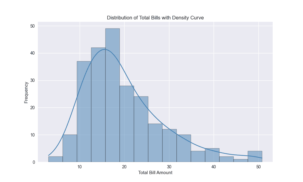
# Seaborn histogram with KDE (Kernel Density Estimation)
plt.figure(figsize=(10, 6))
sns.histplot(tips['total_bill'], bins=15, kde=True, color='steelblue')
plt.title('Distribution of Total Bills with Density Curve')
plt.xlabel('Total Bill Amount')
plt.ylabel('Frequency')
plt.show()
# Comparing distributions by day with seaborn
plt.figure(figsize=(12, 6))
sns.histplot(data=tips, x='total_bill', hue='day', bins=12,
alpha=0.7, palette='viridis', multiple='layer')
plt.title('Distribution of Total Bills by Day')
plt.xlabel('Total Bill Amount')
plt.ylabel('Frequency')
plt.show()