Create stunning pie charts to visualize proportions and percentages. Upload your own data or try our sample datasets.
A pie chart is a circular statistical graphic that divides data into slices to illustrate numerical proportions. Each slice represents a category's contribution to the whole dataset, with the entire circle representing 100% of the data. The size of each slice is directly proportional to its percentage of the total, making pie charts ideal for visualizing parts-of-a-whole relationships.

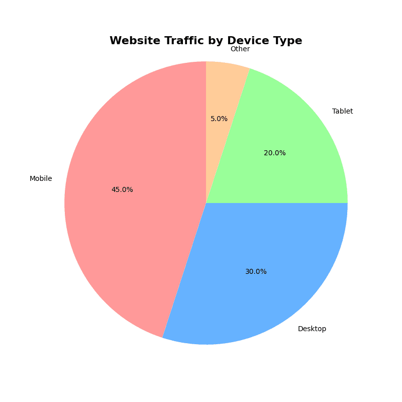
The diagram above illustrates all components of a pie chart. Each slice's angle and area correspond to its proportion of the total, with labels and percentages providing clarity for interpretation.
Pie charts are most effective when:
Pie charts have several limitations that can make them less effective for certain types of data:
When dealing with many categories or when precise comparisons are important, consider using a bar chart instead. For temporal data, a line chart is often more appropriate.
Here are examples of creating pie charts in R using base R and ggplot2 package.
# sample data
categories <- c("Category A", "Category B", "Category C", "Category D")
values <- c(25, 35, 20, 20)

# Basic pie chart
pie(values, labels = categories,
    main = "Sample Pie Chart",
    col = c("#FF9999", "#66B2FF", "#99FF99", "#FFCC99"))

# Add percentages to labels
percentages <- round(values/sum(values)*100, 1)
labels_with_pct <- paste(categories, "
", percentages, "%", sep="")

pie(values, labels = labels_with_pct,
    main = "Pie Chart with Percentages",
    col = rainbow(length(values)))
library(tidyverse)

data <- tibble(
  category = c("Category A", "Category B", "Category C", "Category D"),
  value = c(25, 35, 20, 20)
)

# calculate percentage and position for labels
data <- data |>
  mutate(
    percent = round(value / sum(value) * 100, 1),
    label = str_glue("{percent}%")
  )

ggplot(data, aes(x = "", y = value, fill = category)) +
  geom_bar(width = 1, stat = "identity", color = "white") +
  coord_polar("y", start = 0) +
  geom_text(aes(label = label),
            position = position_stack(vjust = 0.5),
            color = "white",
            size = 5,
            fontface = "bold") +
  scale_fill_manual(values = c("#FF6F61", "#6B5B95", "#88B04B", "#F7CAC9")) +
  labs(title = "Distribution of Categories", fill = "Category") +
  theme_void() +
  theme(
    plot.title = element_text(hjust = 0.5, size = 16, face = "bold"),
    legend.title = element_text(size = 12),
    legend.text = element_text(size = 10)
  )
Here's how to create pie charts in Python using matplotlib, seaborn, and plotly.
import matplotlib.pyplot as plt
import numpy as np
import pandas as pd

# sample data
categories = ['Mobile', 'Desktop', 'Tablet', 'Other']
values = [45, 30, 20, 5]
colors = ['#FF9999', '#66B2FF', '#99FF99', '#FFCC99']

plt.figure(figsize=(8, 8))
plt.pie(values, labels=categories, colors=colors, autopct='%1.1f%%', startangle=90)
plt.title('Website Traffic by Device Type', fontsize=16, fontweight='bold')
plt.axis('equal')
plt.show()
Excel provides built-in tools for creating pie charts. Here's a step-by-step guide:
Organize your data in two columns: categories in the first column and values in the second column.
Highlight both columns including headers (A1:B5 in this example).
Add Data Labels:
Change Colors:
Pull Out a Slice: