The Box Plot (or Box-and-Whisker Plot) helps you visualize data distributions by displaying the five-number summary: minimum, first quartile, median, third quartile, and maximum. Combined with outlier detection and group comparisons, it provides comprehensive insights into your data's spread and central tendency. It's particularly useful for comparing distributions across categories, identifying outliers in datasets, and understanding data variability at a glance. Simply upload your data or use our sample datasets to create professional box plots. Not sure where to start? Check out our step-by-step tutorial.
A box plot (also known as a box and whisker plot) is a standardized way to display data distribution based on five key statistics: minimum, first quartile (Q1), median, third quartile (Q3), and maximum. It's particularly useful for comparing distributions across multiple groups and identifying outliers.

The diagram above illustrates all components of a box plot. The box represents the interquartile range (IQR) containing the middle 50% of data, while whiskers extend to show the typical data range.
Want to see a box plot in action? Follow these steps:
You'll instantly see how spending varies across different days.
Understanding how to create a box plot manually helps you grasp the underlying statistics. Here's a step-by-step guide:
65, 72, 68, 74, 61, 76, 71, 69, 73, 67, 70, 68, 75, 62, 77
Arrange values from smallest to largest:
61, 62, 65, 67, 68, 68, 69, 70, 71, 72, 73, 74, 75, 76, 77
With 15 values, the median is the 8th value:
Median = 70
Q1 is the median of the lower half (excluding the median):
Lower half: 61, 62, 65, 67, 68, 68, 69
Q1 = 67
Q3 is the median of the upper half:
Upper half: 71, 72, 73, 74, 75, 76, 77
Q3 = 74
IQR = Q3 - Q1
IQR = 74 - 67 = 7
Lower fence = Q1 - 1.5 × IQR = 67 - 10.5 = 56.5
Upper fence = Q3 + 1.5 × IQR = 74 + 10.5 = 84.5
Whiskers extend to the most extreme values within the fences:
Lower whisker ends at: 61 (smallest value ≥ 56.5)
Upper whisker ends at: 77 (largest value ≤ 84.5)
Any values beyond the fences are outliers.
In this example: No outliers (all values are within fences)
• Draw a number line with appropriate scale
• Draw a box from Q1 (67) to Q3 (74)
• Draw a line inside the box at the median (70)
• Draw whiskers from the box to 61 and 77
• Mark any outliers as individual points
Pro Tip:
The method shown here uses the "exclusive" approach, which matches Excel and gives whole numbers from the dataset. Modern statistical software often uses "linear" interpolation by default, which can produce fractional values (e.g., Q1 = 67.25 instead of 67).
IQR = Q3 - Q1
Lower fence = Q1 - 1.5 × IQR
Upper fence = Q3 + 1.5 × IQR
Q1 = 25th percentile
Q2 (Median) = 50th percentile
Q3 = 75th percentile
Here's a simple example of creating and customizing a box plot in R using theggplot2 package.
library(tidyverse)

tips <- read.csv("https://raw.githubusercontent.com/plotly/datasets/master/tips.csv")

# basic box plot of total bills
ggplot(tips, aes(y = total_bill)) +
  geom_boxplot(fill = "steelblue", color = "darkblue") +
  labs(title = "Distribution of Total Bills",
       y = "Total Bill Amount") +
  theme_minimal()

# box plot grouped by day
ggplot(tips, aes(x = day, y = total_bill)) +
  geom_boxplot(fill = "steelblue", color = "darkblue") +
  labs(title = "Restaurant Bills by Day of Week",
       x = "Day",
       y = "Total Bill Amount") +
  theme_minimal()

# box plot with individual points
ggplot(tips, aes(x = day, y = total_bill)) +
  geom_boxplot(fill = "steelblue", color = "darkblue", alpha = 0.7) +
  geom_jitter(width = 0.2, alpha = 0.3, color = "darkred") +
  labs(title = "Restaurant Bills by Day with Individual Points",
       x = "Day",
       y = "Total Bill Amount") +
  theme_minimal()

# faceted box plot by time (figure below)
ggplot(tips, aes(x = day, y = total_bill, fill = time)) +
  geom_boxplot(alpha = 0.7) +
  facet_wrap(~time) +
  scale_fill_manual(values = c("Lunch" = "lightblue", "Dinner" = "steelblue")) +
  labs(title = "Restaurant Bills by Day and Time",
       x = "Day",
       y = "Total Bill Amount") +
  theme_minimal() +
  theme(legend.position = "none")
This code creates faceted box plots showing the distribution of total bills by day of the week, separated into lunch and dinner times. The box plots reveal differences in spending patterns across different days and meal times.
For publication-quality box plots with statistical comparisons, theggpubr package provides additional features.
library(ggpubr)

tips <- read.csv("https://raw.githubusercontent.com/plotly/datasets/master/tips.csv")

# publication-ready box plot with p-values
ggboxplot(tips, x = "day", y = "total_bill",
          color = "day", palette = "jco",
          add = "jitter", shape = "day",
          title = "Restaurant Bills by Day",
          xlab = "Day of Week",
          ylab = "Total Bill ($)") +
  stat_compare_means(method = "anova", label.y = 55) +
  stat_compare_means(comparisons = list(c("Thur", "Fri"),
                                       c("Sat", "Sun")),
                     method = "t.test", label.y = c(45, 50))

# box plot comparing lunch vs dinner with statistics
ggboxplot(tips, x = "time", y = "total_bill",
          color = "time", palette = "npg",
          add = "jitter",
          add.params = list(size = 0.1, alpha = 0.5),
          title = "Total Bills: Lunch vs Dinner",
          xlab = "Meal Time",
          ylab = "Total Bill ($)") +
  stat_compare_means(method = "t.test",
                     label = "p.format",
                     label.y = 52)
Here's how to create box plots in Python using popular visualization libraries like matplotlib and seaborn.
import pandas as pd
import matplotlib.pyplot as plt
import seaborn as sns
# Load the data
tips = pd.read_csv("https://raw.githubusercontent.com/plotly/datasets/master/tips.csv")
# Set style for better-looking plots
plt.style.use('seaborn-v0_8')
sns.set_palette("husl")
# Define the order for categorical variables
day_order = ['Thur', 'Fri', 'Sat', 'Sun']
time_order = ['Lunch', 'Dinner']
# Basic box plot with matplotlib
plt.figure(figsize=(8, 6))
plt.boxplot(tips['total_bill'])
plt.ylabel('Total Bill Amount')
plt.title('Distribution of Total Bills')
plt.show()
# Box plot by day with seaborn
plt.figure(figsize=(10, 6))
sns.boxplot(data=tips, x='day', y='total_bill', order=day_order, color='steelblue')
plt.title('Restaurant Bills by Day of Week')
plt.xlabel('Day')
plt.ylabel('Total Bill Amount')
plt.show()
# Box plot with individual points
plt.figure(figsize=(10, 6))
sns.boxplot(data=tips, x='day', y='total_bill', order=day_order, color='lightblue')
sns.stripplot(data=tips, x='day', y='total_bill', order=day_order,
color='darkred', alpha=0.5, size=4)
plt.title('Restaurant Bills by Day with Individual Points')
plt.xlabel('Day')
plt.ylabel('Total Bill Amount')
plt.show()
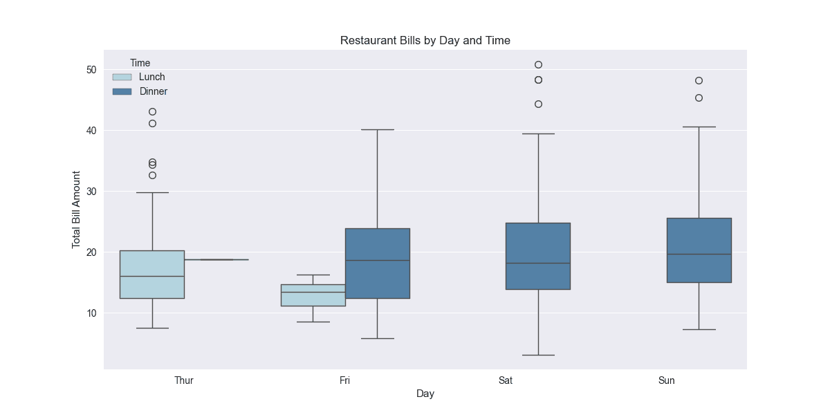
# Box plot by time and day (figure below)
plt.figure(figsize=(12, 6))
sns.boxplot(data=tips, x='day', y='total_bill', hue='time',
order=day_order, hue_order=time_order,
palette={'Lunch': 'lightblue', 'Dinner': 'steelblue'})
plt.title('Restaurant Bills by Day and Time')
plt.xlabel('Day')
plt.ylabel('Total Bill Amount')
plt.legend(title='Time')
plt.show()