Create beautiful bubble charts from your data. Upload your own data or try our sample datasets.
A bubble chart is a type of scatter plot where data points are displayed as bubbles, with the size of each bubble representing a third data dimension. This visualization lets you show relationships between three numeric variables simultaneously.
Use libraries matplotlib and seaborn to create bubble charts in Python. Below are examples using the popular "tips" dataset.
import pandas as pd
import matplotlib.pyplot as plt
import seaborn as sns
import numpy as np

tips = pd.read_csv("https://raw.githubusercontent.com/plotly/datasets/master/tips.csv")

# Set style for better-looking plots
plt.style.use('seaborn-v0_8')
sns.set_palette("husl")

# basic bubble chart with matplotlib
plt.figure(figsize=(10, 6))
bubble_sizes = tips['size'] * 50  # Scale party size for visibility
plt.scatter(tips['total_bill'], tips['tip'], s=bubble_sizes, alpha=0.6, c='steelblue', edgecolors='white', linewidth=0.5)
plt.title('Bubble Chart: Tips vs Total Bill (Bubble Size = Party Size)')
plt.xlabel('Total Bill ($)')
plt.ylabel('Tip Amount ($)')
plt.grid(True, alpha=0.3)
plt.show()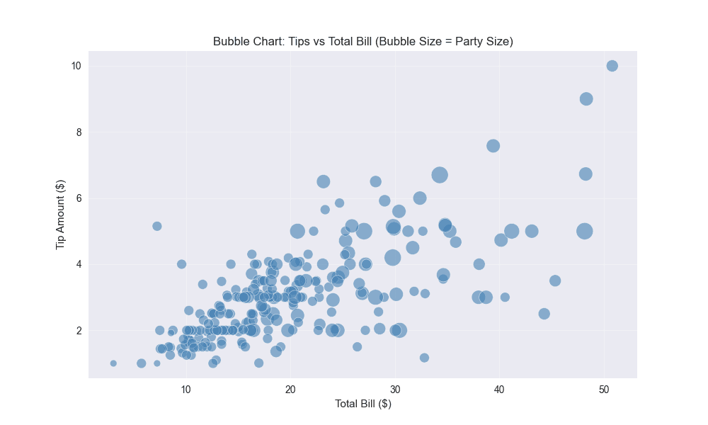
# multi-dimensional bubble chart
plt.figure(figsize=(12, 8))
sns.scatterplot(data=tips, x='total_bill', y='tip',
                hue='time', size='size', sizes=(100, 400),
                palette='viridis', alpha=0.7, edgecolor='white', linewidth=0.5)
plt.title('Multi-Dimensional Bubble Chart: Restaurant Tips Analysis')
plt.xlabel('Total Bill ($)')
plt.ylabel('Tip Amount ($)')
plt.legend(title='Time of Day', bbox_to_anchor=(1.05, 1), loc='upper left')
plt.tight_layout()
plt.show()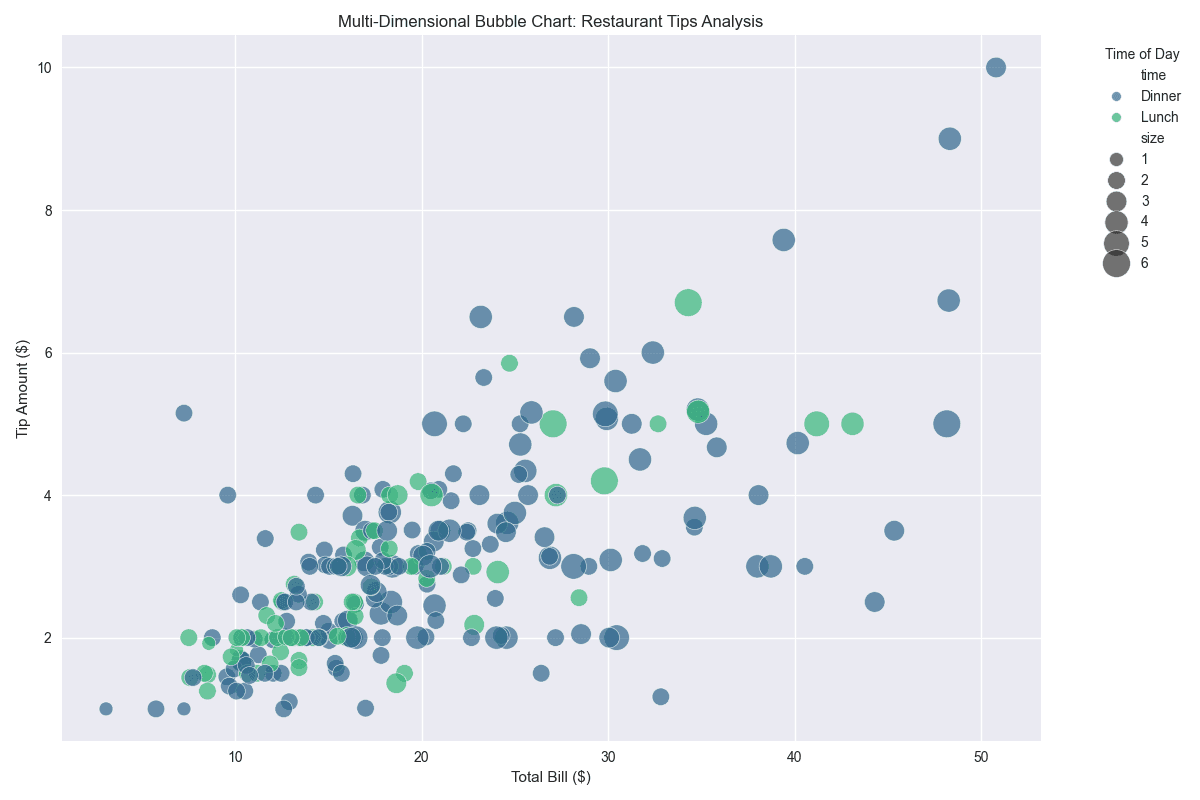
R is a statistical programming language that excels at creating publication-quality scatter plots, especially with the ggplot2 package.
library(tidyverse)

# Load tips dataset
tips <- read.csv("https://raw.githubusercontent.com/plotly/datasets/master/tips.csv")

# Basic bubble chart
ggplot(tips, aes(x = total_bill, y = tip, size = size)) +
  geom_point(alpha = 0.7, color = "steelblue", stroke = 0.5) +
  scale_size_continuous(name = "Party Size", range = c(2, 12)) +
  labs(title = "Restaurant Tips Bubble Chart",
       subtitle = "Bubble size represents party size",
       x = "Total Bill ($)",
       y = "Tip Amount ($)") +
  theme_minimal()

# Bubble chart with color and size mapping
ggplot(tips, aes(x = total_bill, y = tip, size = size, color = tip)) +
  geom_point(alpha = 0.7, stroke = 0.5) +
  scale_color_gradient(low = "lightblue", high = "darkred", name = "Tip Amount") +
  scale_size_continuous(name = "Party Size", range = c(3, 15)) +
  labs(title = "Tips Bubble Chart with Color Gradient",
       x = "Total Bill ($)",
       y = "Tip Amount ($)") +
  theme_minimal()

# Calculate correlation coefficient
cor_value <- cor(tips$total_bill, tips$tip)
print(paste("Correlation coefficient:", round(cor_value, 4)))

# Bubble chart with time of day as color
ggplot(tips, aes(x = total_bill, y = tip, size = size, color = time)) +
  geom_point(alpha = 0.8, stroke = 0.5) +
  scale_color_viridis_d(name = "Time of Day") +
  scale_size_continuous(name = "Party Size", range = c(3, 15)) +
  labs(title = "Restaurant Tips Bubble Chart by Time of Day",
       x = "Total Bill ($)",
       y = "Tip Amount ($)") +
  theme_minimal()
# multi-dimensional bubble chart with facets
ggplot(tips, aes(x = total_bill, y = tip, size = size, color = day)) +
  geom_point(alpha = 0.7, stroke = 0.5) +
  facet_wrap(~time, labeller = labeller(time = c("Lunch" = "Lunch", "Dinner" = "Dinner"))) +
  scale_color_brewer(palette = "Set1", name = "Day") +
  scale_size_continuous(name = "Party Size", range = c(2, 12)) +
  labs(title = "Multi-Dimensional Bubble Chart Analysis",
       subtitle = "Faceted by time, colored by day, bubble size = party size",
       x = "Total Bill ($)",
       y = "Tip Amount ($)") +
  theme_minimal() +
  theme(legend.position = "bottom")