This line chart maker helps you visualize trends and patterns in your data - whether you're tracking a single variable over time, comparing multiple series side-by-side, or analyzing changes across ordered categories. You can easily customize everything: choose between straight lines or smooth curves, show or hide data point markers, sort your x-axis values in any order you need, and apply professional themes for publication-ready charts. Display multiple lines with distinct colors to compare trends, adjust line thickness and styles for better clarity, and fine-tune every aspect of your visualization. Perfect for time series data, stock prices, temperature changes, sales trends, or any continuous data. Not sure how to begin? Check out our step-by-step tutorial.
A line chart (or line graph) is a type of chart that displays information as a series of data points connected by straight line segments. Line charts are ideal for showing trends over time, continuous data, or changes in values across ordered categories.
For example, select date to track stock prices over time
Leave as None for a single line chart as our sample data is in a wide format
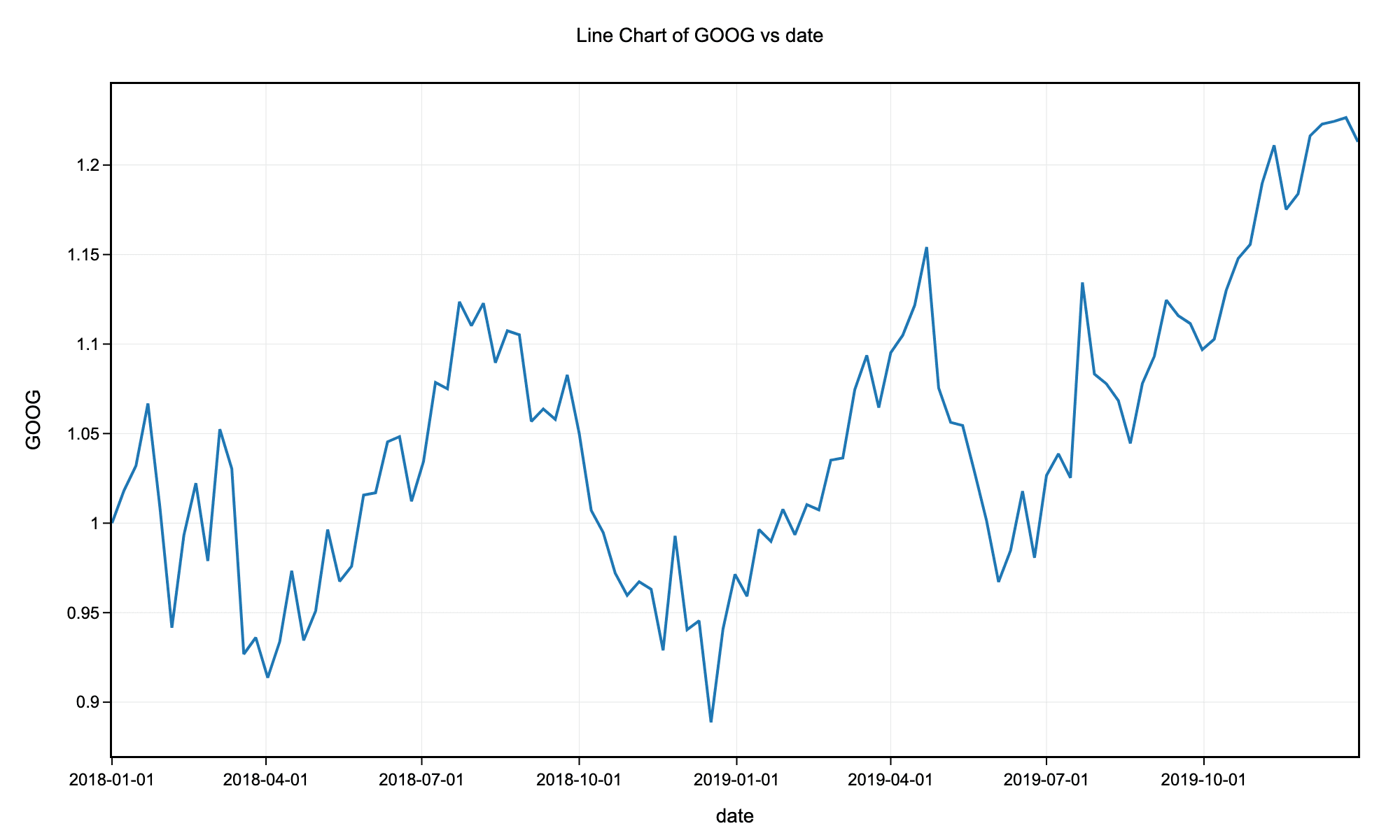
Example line chart with science theme without markers for the stock price history of GOOG.
For example, select date to track stock prices over time
Use line charts when your x-axis represents an ordered sequence (like time) and you want to show trends or changes. Use scatter plots when you want to show the relationship between two continuous variables without implying a specific order or connection between points.
Not necessarily. While starting at zero is important for bar charts, line charts focus on trends and patterns rather than absolute magnitudes. Starting the y-axis at a value other than zero can make subtle changes more visible. However, be transparent about your axis range to avoid misleading viewers.
For optimal readability, limit your line chart to 5-7 lines. If you have more series, consider using multiple charts, filtering to show only the most important series, or using interactive features that allow users to select which lines to display.
Use linear interpolation (straight lines) when you want to show precise data points and exact changes. Use smooth (spline) interpolation when you want to emphasize overall trends and the data represents a continuous process. Avoid smooth lines if they might imply precision where none exists.
Show markers when you have relatively few data points (less than 20-30) and want to emphasize individual measurements. Hide markers when you have many data points or when the focus should be on the overall trend rather than specific values.
Use clear, descriptive labels for both axes. Choose distinct colors for multiple lines and include a legend. Avoid cluttering with too many lines. Consider highlighting the most important line or using different line styles (solid, dashed) to differentiate series. Always provide context about what the data represents.
library(tidyverse)

# Load stock price data
stocks <- read.csv("https://raw.githubusercontent.com/plotly/datasets/master/finance-charts-apple.csv")

# Convert date column to Date type
stocks$Date <- as.Date(stocks$Date)

# Simple line chart - closing price over time
ggplot(stocks, aes(x = Date, y = AAPL.Close)) +
  geom_line(color = "steelblue", size = 1) +
  geom_point(color = "steelblue", size = 2) +
  labs(title = "Apple Stock Closing Price Over Time",
       x = "Date",
       y = "Closing Price ($)") +
  theme_minimal() +
  theme(axis.text.x = element_text(angle = 45, hjust = 1))

# Multiple lines - comparing High and Low prices
stocks_long <- stocks %>%
  select(Date, AAPL.High, AAPL.Low) %>%
  pivot_longer(cols = c(AAPL.High, AAPL.Low),
               names_to = "Price_Type",
               values_to = "Price") %>%
  mutate(Price_Type = recode(Price_Type,
                              "AAPL.High" = "High",
                              "AAPL.Low" = "Low"))

ggplot(stocks_long, aes(x = Date, y = Price, color = Price_Type)) +
  geom_line(size = 1) +
  labs(title = "Apple Stock High vs Low Prices",
       x = "Date",
       y = "Price ($)",
       color = "Price Type") +
  scale_color_manual(values = c("High" = "#E63946", "Low" = "#457B9D")) +
  theme_minimal() +
  theme(axis.text.x = element_text(angle = 45, hjust = 1))

# Smooth line chart
ggplot(stocks, aes(x = Date, y = AAPL.Close)) +
  geom_smooth(method = "loess", color = "steelblue", fill = "lightblue") +
  labs(title = "Apple Stock Price Trend (Smoothed)",
       x = "Date",
       y = "Closing Price ($)") +
  theme_minimal()
The ggpubr package provides the ggline() function for creating publication-ready line charts:
library(tidyverse)
library(ggpubr)

# Load stock price data
stocks <- read.csv("https://raw.githubusercontent.com/plotly/datasets/master/finance-charts-apple.csv")
stocks$Date <- as.Date(stocks$Date)

# Prepare data with multiple series
stocks_long <- stocks %>%
  select(Date, AAPL.High, AAPL.Low, AAPL.Close) %>%
  pivot_longer(cols = c(AAPL.High, AAPL.Low, AAPL.Close),
               names_to = "Price_Type",
               values_to = "Price") %>%
  mutate(Price_Type = recode(Price_Type,
                              "AAPL.High" = "High",
                              "AAPL.Low" = "Low",
                              "AAPL.Close" = "Close"))

# Create line plot using ggline
ggline(
  stocks_long,
  x = "Date",
  y = "Price",
  color = "Price_Type",
  palette = "jco",
  linewidth = 1,
  title = "Apple Stock Prices Over Time",
  xlab = "Date",
  ylab = "Price ($)",
  legend.title = "Price Type",
  ggtheme = theme_pubr()
) +
  font("title", size = 14, face = "bold") +
  font("xlab", size = 12) +
  font("ylab", size = 12) +
  rotate_x_text(45)
import pandas as pd
import matplotlib.pyplot as plt
import seaborn as sns

# Load stock price data
stocks = pd.read_csv("https://raw.githubusercontent.com/plotly/datasets/master/finance-charts-apple.csv")
stocks['Date'] = pd.to_datetime(stocks['Date'])

# Simple line chart - closing price
plt.figure(figsize=(12, 6))
plt.plot(stocks['Date'], stocks['AAPL.Close'], color='steelblue', linewidth=2, marker='o', markersize=4)
plt.title('Apple Stock Closing Price Over Time', fontsize=16)
plt.xlabel('Date', fontsize=12)
plt.ylabel('Closing Price ($)', fontsize=12)
plt.xticks(rotation=45)
plt.grid(True, alpha=0.3)
plt.tight_layout()
plt.show()

# Multiple lines - comparing High, Low, and Close
plt.figure(figsize=(12, 6))
plt.plot(stocks['Date'], stocks['AAPL.High'], label='High', linewidth=2)
plt.plot(stocks['Date'], stocks['AAPL.Low'], label='Low', linewidth=2)
plt.plot(stocks['Date'], stocks['AAPL.Close'], label='Close', linewidth=2)
plt.title('Apple Stock Prices: High, Low, and Close', fontsize=16)
plt.xlabel('Date', fontsize=12)
plt.ylabel('Price ($)', fontsize=12)
plt.legend()
plt.xticks(rotation=45)
plt.grid(True, alpha=0.3)
plt.tight_layout()
plt.show()

# Using Seaborn for styled line chart
plt.figure(figsize=(12, 6))
sns.lineplot(data=stocks, x='Date', y='AAPL.Close', linewidth=2.5)
plt.title('Apple Stock Closing Price (Seaborn Style)', fontsize=16)
plt.xlabel('Date', fontsize=12)
plt.ylabel('Closing Price ($)', fontsize=12)
plt.xticks(rotation=45)
plt.tight_layout()
plt.show()

# Multiple series with Seaborn
stocks_melted = stocks.melt(id_vars=['Date'],
                             value_vars=['AAPL.High', 'AAPL.Low', 'AAPL.Close'],
                             var_name='Price Type',
                             value_name='Price')
stocks_melted['Price Type'] = stocks_melted['Price Type'].str.replace('AAPL.', '')

plt.figure(figsize=(12, 6))
sns.lineplot(data=stocks_melted, x='Date', y='Price', hue='Price Type', linewidth=2)
plt.title('Apple Stock Prices Comparison', fontsize=16)
plt.xlabel('Date', fontsize=12)
plt.ylabel('Price ($)', fontsize=12)
plt.xticks(rotation=45)
plt.legend(title='Price Type')
plt.tight_layout()
plt.show()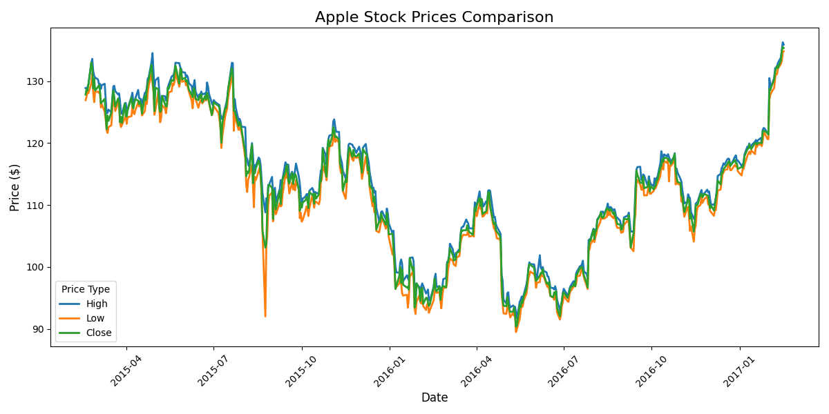
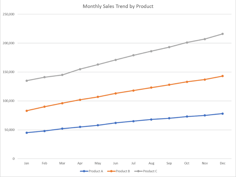
Month	Product A	Product B	Product C
Jan	45000	38000	52000
Feb	48000	42000	51000
Mar	52000	44000	49000
Apr	55000	47000	53000
May	58000	49000	56000
Jun	62000	51000	58000
Jul	65000	53000	61000
Aug	68000	55000	63000
Sep	70000	58000	65000
Oct	73000	60000	68000
Nov	75000	62000	70000
Dec	78000	65000	73000