Create informative dot plots to visualize the distribution of your data points. Upload your own data or try our sample datasets.
One click loads the sample data and pre-selects sensible columns. Then hit Generate Dot Plot below.
Uses Freedman-Diaconis rule to pick optimal bin width
A dot plot is a statistical chart that displays data points as dots positioned along an axis. Each dot represents a single data point, making it an excellent visualization for showing the distribution of values in a dataset. Dot plots are particularly useful when dealing with smaller datasets, as they preserve the visibility of individual data points.
Dot plots shine when you want to see every observation, not just a summary. Reach for one when:
For datasets with thousands of points, a histogram or density plot is usually easier to read — individual dots become overwhelming.
"Dot plot" is used loosely in practice. These are the main variants you'll encounter:
The style this tool produces by default. Continuous values are binned and dots stack vertically within each bin, mirroring a histogram while preserving individual points. Originally proposed by Leland Wilkinson in 1999.
For discrete integer data (counts, scores), dots stack at the exact value instead of at a bin center. This tool detects integer data automatically and switches to this mode, so 1, 2, 3 land on whole-number tick marks.
A ranked, categorical variant introduced by William Cleveland. One dot per category sits on a horizontal scale — think "average income by state" with states sorted from highest to lowest. It's a cleaner substitute for horizontal bar charts when you only need a single value per category.
Dots are placed on a single axis with small random jitter to prevent overlap. Useful for showing a raw distribution next to a box plot or violin plot as a companion layer.
When interpreting a dot plot, consider the following:
Dot plots offer several advantages over similar chart types:
The ggplot2 package provides the geom_dotplot() function.
library(tidyverse)

tips <- read.csv("https://raw.githubusercontent.com/plotly/datasets/master/tips.csv")

# use default binning
ggplot(tips, aes(x = tip)) +
  geom_dotplot() +
  theme_minimal()

# specify binwidth since some bin contains too many points
ggplot(tips, aes(x = tip)) +
  geom_dotplot(binpositions = "all", binwidth = 0.2) +
  theme_minimal()

# if you don't want to see the y ticks
ggplot(tips, aes(x = tip)) +
  geom_dotplot(binpositions = "all", binwidth = 0.2) +
  theme_minimal() +
  theme(axis.ticks.y = element_blank(), axis.text.y = element_blank())
While Python's popular libraries like Matplotlib and Seaborn do not have a dedicated dot plot function, you can create dot plots using scatter plots or by stacking points vertically. Here's an example using Matplotlib:
import numpy as np

tips = pd.read_csv("https://raw.githubusercontent.com/plotly/datasets/master/tips.csv")

x = tips["tip"]
counts, bins = np.histogram(x, bins=20)

for i, count in enumerate(counts):
    for j in range(count):
        plt.plot(bins[i] + (bins[i+1]-bins[i])/2, j+1, "o", color="steelblue")

plt.xlabel("Tip amount")
plt.ylabel("Count (in dots)")
plt.title("Dot histogram of tips")
plt.show()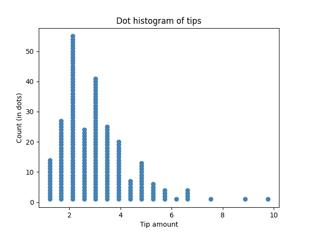
Both summarize distributions by binning values, but a histogram draws a solid bar whose height encodes count, while a dot plot stacks one dot per observation. Dot plots preserve individual data points, making small counts, gaps, and outliers easier to spot. Histograms scale better to very large datasets.
Use a dot plot when the shape of the distribution matters — multimodality, clusters, gaps, or small sample sizes. Box plots compress data into five summary statistics (min, Q1, median, Q3, max) and can hide bimodality or unusual patterns entirely. For small samples (n < 30) a dot plot is almost always more honest.
That's a Wilkinson-style dot plot. Continuous values are grouped into bins and the dots within each bin are stacked vertically so you can count them. Switching the Binning Method to a smaller bin width will produce taller, narrower columns; larger bin widths produce wider, shorter ones.
The Auto setting uses the Freedman–Diaconis rule, which adapts to your data's spread and sample size and works well for most datasets. If the plot looks too jagged, reduce the number of bins; if it looks too blocky and hides features, increase it. For integer data the tool skips binning entirely and stacks at exact values.
Yes — pick a Color Column in Section 2. Dots from different groups are colored separately and stacked together within each bin, which makes group overlap and separation visually obvious. This is especially useful for experimental data where you want to compare a treatment and control.
A Cleveland dot plot shows one dot per category on a ranked axis — for example, average sales by region, sorted high to low. It's a cleaner alternative to a horizontal bar chart. This tool currently focuses on distribution-style (Wilkinson) dot plots; for Cleveland plots, use the Lollipop Chart Maker, which produces the same ranked-category view.
Dot plots stay readable up to a few hundred points. Beyond roughly 500–1,000 observations the stacks get tall enough that individual dots lose meaning — switch to a histogram, density plot, or violin plot for larger samples.