The Heat Map is a powerful data visualization tool that represents values in a matrix format using color gradients, making it easy to identify patterns, correlations, and trends at a glance. Heat maps use color intensity to encode numerical values across two categorical dimensions, transforming complex data into an intuitive visual format. They're particularly effective for correlation analysis, comparing categories across multiple variables, analyzing temporal patterns, and identifying clusters in data. Simply upload your data or use our sample datasets to create professional heat maps with customizable color schemes and clustering options.
A heat map is a data visualization technique that uses color coding to represent values in a two-dimensional matrix. Each cell corresponds to a unique combination of row and column categories, with color intensity indicating the magnitude of the value. This visual encoding makes it easy to quickly identify patterns, outliers, and trends in complex datasets.
Here's how to create heat maps in R using the ggplot2 package.
library(tidyverse)
library(pheatmap)

# Load the tips dataset
tips <- read.csv("https://raw.githubusercontent.com/plotly/datasets/master/tips.csv")

# Using ggplot2 for heat map
tips_summary <- tips %>%
  group_by(day, sex) %>%
  summarise(avg_tip = mean(tip), .groups = 'drop')

ggplot(tips_summary, aes(x = sex, y = day, fill = avg_tip)) +
  geom_tile(color = "white") +
  geom_text(aes(label = round(avg_tip, 2)), color = "black", size = 4) +
  scale_fill_gradient2(low = "blue", mid = "white", high = "red",
                       midpoint = median(tips_summary$avg_tip),
                       name = "Average Tip") +
  labs(title = "Average Tips by Day and Sex",
       x = "Sex", y = "Day of Week") +
  theme_minimal() +
  theme(plot.title = element_text(hjust = 0.5))
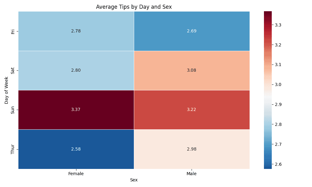
Here's how to create heat maps in Python using seaborn and matplotlib.
import pandas as pd
import matplotlib.pyplot as plt
import seaborn as sns

# Load the tips dataset
tips = pd.read_csv("https://raw.githubusercontent.com/plotly/datasets/master/tips.csv")

# Create pivot table for heat map
heatmap_data = tips.pivot_table(values='tip', index='day',
                                columns='sex', aggfunc='mean')

# Basic heat map with seaborn
plt.figure(figsize=(10, 6))
sns.heatmap(heatmap_data, annot=True, fmt='.2f', cmap='RdBu_r',
            center=heatmap_data.mean().mean(), linewidths=0.5)
plt.title('Average Tips by Day and Sex')
plt.xlabel('Sex')
plt.ylabel('Day of Week')
plt.tight_layout()
plt.show()