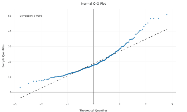
The Q-Q (Quantile-Quantile) Plot helps you assess whether your data follows a normal distribution by comparing your sample quantiles against theoretical normal quantiles. Combined with the Shapiro-Wilk normality test, it provides both visual and statistical evidence of normality. It's particularly useful for validating assumptions in statistical tests, analyzing regression residuals, and identifying potential outliers. Simply input your data to create an Q-Q plot and calculate the corresponding Shapiro-Wilk test statistics. You can test this plot maker by loading the sample dataset named "tips" and select the "total_bill" column.
If you need more comprehensive normality testing, consider using the Normality Test Calculator, which performs three different normality tests (Shapiro-Wilk, Anderson-Darling, and Kolmogorov-Smirnov) and provides detailed results and visualizations.
💡 With "None" selected, you can customize the chart
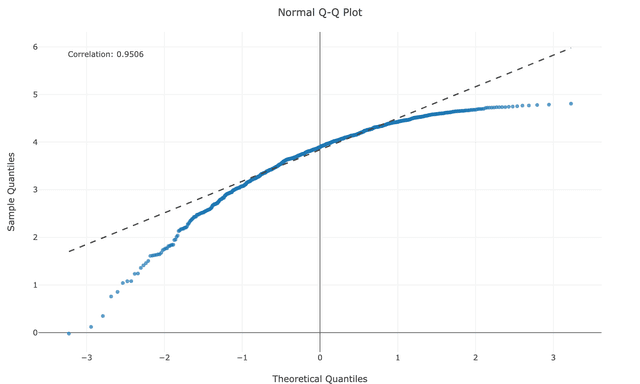
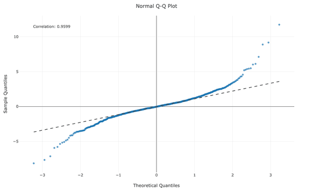
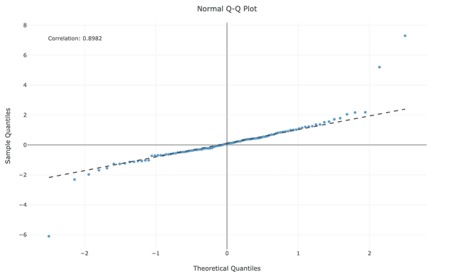
A Q-Q (Quantile-Quantile) plot is a graphical tool used to assess whether a dataset follows a normal distribution. It plots the quantiles of your data against the theoretical quantiles of a normal distribution, creating a visual way to identify departures from normality.
Understanding specific patterns in your QQ plot helps diagnose exactly how your data deviates from normality:
When your data isn't normally distributed, transformations can help normalize it for statistical analysis:
new_value = log(original_value)
Best for: Highly skewed data that spans multiple orders of magnitude. Common in finance, biology, and economics. Requires all values to be positive.
new_value = sqrt(original_value)
Best for: Moderately skewed data or count data that follows a Poisson distribution. Requires non-negative values.
new_value = 1/original_value
Best for: Very highly skewed data. Note that this reverses the order of values.
new_value = original_value²
Best for: Mildly to moderately left-skewed data.
new_value = original_value³
Best for: More severely left-skewed data.
new_value = log(max_value + 1 - original_value)
Best for: Severe negative skewness. This approach reflects the distribution, applies a log transform, then can be reflected back if needed.
new_value = (original_value^λ - 1)/λ for λ ≠ 0,
new_value = log(original_value) for λ = 0
Best for: Finding the optimal transformation by automatically selecting the lambda parameter that best normalizes the data. Requires positive values.
Similar to Box-Cox but works with negative values as well.
Best for: When you need a Box-Cox-like approach but have negative values in your dataset.
new_value = (original_value - median) / IQR
Best for: When outliers are distorting your distribution. This uses the median and interquartile range instead of mean and standard deviation.
Ready to transform your data? Our Normality Transformation Tool lets you apply log, square, and Box-Cox transformations with just a few clicks.
R provides excellent tools for creating Q-Q plots. Here's a simple example using ggplot2:
library(tidyverse)

# Load sample dataset
tips <- read.csv("https://raw.githubusercontent.com/plotly/datasets/master/tips.csv")

# Create Q-Q plot
ggplot(tips, aes(sample = total_bill)) +
  stat_qq() +
  stat_qq_line(color = "red") +
  labs(title = "Normal Q-Q Plot for Total Bill",
       x = "Theoretical Quantiles",
       y = "Sample Quantiles") +
  theme_minimal()
This code creates a Q-Q plot for the 'total_bill' variable from a restaurant tips dataset. The red line represents the theoretical normal distribution.
Python also provides powerful libraries for creating Q-Q plots. Here's an example using Matplotlib and SciPy:
import pandas as pd
import numpy as np
import matplotlib.pyplot as plt
import scipy.stats as stats
import seaborn as sns

tips = pd.read_csv("https://raw.githubusercontent.com/plotly/datasets/master/tips.csv")

fig, ax = plt.subplots(figsize=(8, 6))
stats.probplot(tips['total_bill'], dist="norm", plot=ax)

ax.set_title("Normal Q-Q Plot for Total Bill", fontsize=14, fontweight='bold')
ax.set_xlabel("Theoretical Quantiles", fontsize=12)
ax.set_ylabel("Sample Quantiles", fontsize=12)
ax.grid(True, alpha=0.3)

line = ax.get_lines()[1]
line.set_color('red')
line.set_linewidth(2)

plt.tight_layout()
plt.show()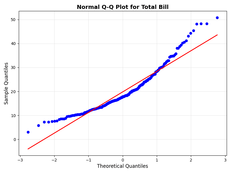
Alternatively, you can use the Seaborn library for a easier approach with built-in styling:
import pandas as pd
import matplotlib.pyplot as plt
import scipy.stats as stats
import seaborn as sns

tips = pd.read_csv("https://raw.githubusercontent.com/plotly/datasets/master/tips.csv")

plt.figure(figsize=(8, 6))
sns.set_style("whitegrid")

# Create Q-Q plot with seaborn styling
stats.probplot(tips['total_bill'], dist="norm", plot=plt)
plt.title("Normal Q-Q Plot for Total Bill")
plt.show()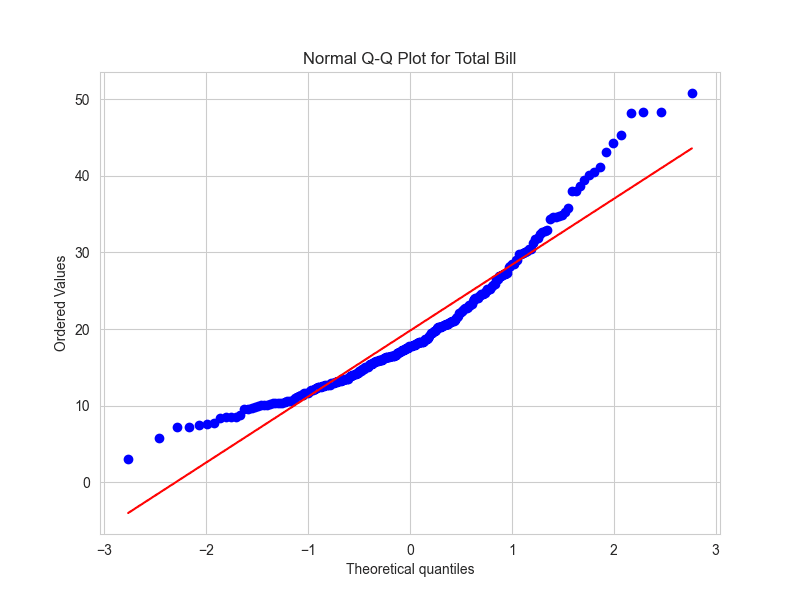
Q-Q plots are particularly useful in these situations:
The effectiveness of Q-Q plots and normality tests can vary with sample size:
When assessing normality, consider both the Q-Q plot and Shapiro-Wilk test results:
The Q-Q (Quantile-Quantile) Plot helps you assess whether your data follows a normal distribution by comparing your sample quantiles against theoretical normal quantiles. Combined with the Shapiro-Wilk normality test, it provides both visual and statistical evidence of normality. It's particularly useful for validating assumptions in statistical tests, analyzing regression residuals, and identifying potential outliers. Simply input your data to create an Q-Q plot and calculate the corresponding Shapiro-Wilk test statistics. You can test this plot maker by loading the sample dataset named "tips" and select the "total_bill" column.
If you need more comprehensive normality testing, consider using the Normality Test Calculator, which performs three different normality tests (Shapiro-Wilk, Anderson-Darling, and Kolmogorov-Smirnov) and provides detailed results and visualizations.
💡 With "None" selected, you can customize the chart
A Q-Q (Quantile-Quantile) plot is a graphical tool used to assess whether a dataset follows a normal distribution. It plots the quantiles of your data against the theoretical quantiles of a normal distribution, creating a visual way to identify departures from normality.
Understanding specific patterns in your QQ plot helps diagnose exactly how your data deviates from normality:
When your data isn't normally distributed, transformations can help normalize it for statistical analysis:
new_value = log(original_value)
Best for: Highly skewed data that spans multiple orders of magnitude. Common in finance, biology, and economics. Requires all values to be positive.
new_value = sqrt(original_value)
Best for: Moderately skewed data or count data that follows a Poisson distribution. Requires non-negative values.
new_value = 1/original_value
Best for: Very highly skewed data. Note that this reverses the order of values.
new_value = original_value²
Best for: Mildly to moderately left-skewed data.
new_value = original_value³
Best for: More severely left-skewed data.
new_value = log(max_value + 1 - original_value)
Best for: Severe negative skewness. This approach reflects the distribution, applies a log transform, then can be reflected back if needed.
new_value = (original_value^λ - 1)/λ for λ ≠ 0,
new_value = log(original_value) for λ = 0
Best for: Finding the optimal transformation by automatically selecting the lambda parameter that best normalizes the data. Requires positive values.
Similar to Box-Cox but works with negative values as well.
Best for: When you need a Box-Cox-like approach but have negative values in your dataset.
new_value = (original_value - median) / IQR
Best for: When outliers are distorting your distribution. This uses the median and interquartile range instead of mean and standard deviation.
Ready to transform your data? Our Normality Transformation Tool lets you apply log, square, and Box-Cox transformations with just a few clicks.
R provides excellent tools for creating Q-Q plots. Here's a simple example using ggplot2:
library(tidyverse)

# Load sample dataset
tips <- read.csv("https://raw.githubusercontent.com/plotly/datasets/master/tips.csv")

# Create Q-Q plot
ggplot(tips, aes(sample = total_bill)) +
  stat_qq() +
  stat_qq_line(color = "red") +
  labs(title = "Normal Q-Q Plot for Total Bill",
       x = "Theoretical Quantiles",
       y = "Sample Quantiles") +
  theme_minimal()
This code creates a Q-Q plot for the 'total_bill' variable from a restaurant tips dataset. The red line represents the theoretical normal distribution.
Python also provides powerful libraries for creating Q-Q plots. Here's an example using Matplotlib and SciPy:
import pandas as pd
import numpy as np
import matplotlib.pyplot as plt
import scipy.stats as stats
import seaborn as sns

tips = pd.read_csv("https://raw.githubusercontent.com/plotly/datasets/master/tips.csv")

fig, ax = plt.subplots(figsize=(8, 6))
stats.probplot(tips['total_bill'], dist="norm", plot=ax)

ax.set_title("Normal Q-Q Plot for Total Bill", fontsize=14, fontweight='bold')
ax.set_xlabel("Theoretical Quantiles", fontsize=12)
ax.set_ylabel("Sample Quantiles", fontsize=12)
ax.grid(True, alpha=0.3)

line = ax.get_lines()[1]
line.set_color('red')
line.set_linewidth(2)

plt.tight_layout()
plt.show()
Alternatively, you can use the Seaborn library for a easier approach with built-in styling:
import pandas as pd
import matplotlib.pyplot as plt
import scipy.stats as stats
import seaborn as sns

tips = pd.read_csv("https://raw.githubusercontent.com/plotly/datasets/master/tips.csv")

plt.figure(figsize=(8, 6))
sns.set_style("whitegrid")

# Create Q-Q plot with seaborn styling
stats.probplot(tips['total_bill'], dist="norm", plot=plt)
plt.title("Normal Q-Q Plot for Total Bill")
plt.show()Q-Q plots are particularly useful in these situations:
The effectiveness of Q-Q plots and normality tests can vary with sample size:
When assessing normality, consider both the Q-Q plot and Shapiro-Wilk test results: